


In October of last year, Montaha Hidefi, VP of Color Forecasting at the Color Marketing Group® (CMG), Color Landing Studio, gave the keynote address at the Powder Coating Summit. She discussed color, and whether the powder coatings industry is riding or orbiting the trends. Hidefi noted that color trends are the manifestation of society development, our identities, how we interact with each other, and how we deal with innovation and technology. They measure the pulse of our social and generational evolution. Macro, consumer and industry trends are constantly converging, overlapping and impacting each other – and influencing and driving color forecasting.
I was interested in learning more about CMG, the industries it serves, how it forecasts color trends, and what the color predictions are for the coming years. Hidefi was happy to answer my questions.

PCI: What does the Color Marketing Group do?
Hidefi: Color Marketing Group (CMG) is a not-for-profit international association of color design professionals. Our members represent a broad spectrum of people who engage daily with color or who are directly involved in making color decisions for a product range, such as designers, marketers, color technicians, scientists, consultants, educators and artists. They typically service a wide range of market sectors such as paints and powder coatings, automotive, interior design, landscaping and architecture, building products, color and effect pigments, plastics, consumer goods, textiles, flooring and wall coverings, cabinetry, furniture, lighting, packaging, cosmetics, fashion, graphic design, visual arts, color products and services, as well as printing.
Our mission is to create relevant and accurate color and trend forecast directions two years in advance. For example, throughout 2020 we will be working on the forecast for 2022, which will be revealed during the CMG International Summit in November 2020.
PCI: What is the difference between a fad and a trend?
Hidefi: The term trend is often used to refer to a fad. However, a trend is a general orientation in which things will move. Trends have an extended life cycle; they follow a curve. At the beginning of a trend there will be early adopters, then the majority of people will adopt the new product and there will be a peak in sales. Eventually, other trends will appear and the curve of the first trend will start declining but will grow again with more people adopting the product.
A fad is a behavior that develops towards a product and is followed with enthusiasm among a large population because it is somehow perceived as novel. We can say, it’s an interest followed with exaggeration. A fad, by its nature, is transitory and short-lived.
Trends are influenced by society, while fads are influenced by companies and driven by emotional excitement. Some examples of fads are the pizza cone, the fidget spinner, diets, hairstyles and toys. An example of a trend is the color silver used in the 2000s in the automotive industry as it represented the new tech world. More recently, we saw the millennial pink color trending in various market sectors for over five consecutive years.
PCI: How does the CMG forecast color?
Hidefi: Every year, CMG forecasts colors for two years in the future. The color forecasting process starts at the beginning of each year, with unique one- or two-day workshops called ChromaZones®, color forecasting workshops. They are held in four geographical areas; North America, Latin America, Europe and Asia Pacific.
During a ChromaZone color forecasting workshop, participants, who represent various industries share their research of color trend stories and associated color directions. The group then spends time discussing, dissecting and narrowing down the information. They examine the topics and their ramifications to color. They discuss the influences and drivers behind each identified color trend story, taking into consideration the timing of the trend stories, the colors, as well as materials and finishes, and which industries they might impact. This process is a deep dive into human behaviors, the environment, economy and politics, both globally and locally.
In each workshop, the top three trend stories are determined, and we develop a forecast of 16 directional colors that support those stories. Each of the four geographical regions must then steer and consolidate their regional workshops, which results into the forecast for that region. The results of the four regions are then consolidated into CMG’s World Color Forecast™ of 64 directional colors, which is revealed during the CMG International Summit that takes place each November in North America.
But the process does not end there. Throughout the year, our members are observing the colors emerging in the markets around the world and validating against the forecasted colors. This process allows us to corroborate the integrity of the forecast on a global level.
PCI: What factors influence color forecasting?
Hidefi: Being directionally and contextually driven, color trends not only influence how material, product and design interact, but they are also influenced by them. The most influential factors that we take into consideration when color forecasting are a) the changes in our society, b) the memorable or unforgettable events we are witnessing, c) the technologies that support new product development, d) the political situation and how society interacts with it, e) the economic scene and how it will affect society, and f) the consequences of environmental changes.
For instance, when it comes to changes in society, their influence on trends and colors might not be seen immediately. The process takes place over time, and the influence can be seen in the long term. For example, the increased number of the seniors’ population as well as consumers with limited mobility is leading to the design of certain products to meet certain needs in the new family cell. These new families need convenient products to meet their lifestyles. These products would need to be designed in new ways, produced with different material and showcased in colors and textures that might differ from their old counterparts. The same can be said on global warming, and how it has influenced every single facet of design and color. Concerns about the environment have moved from being just a tendency to becoming a basis for a more responsible, eco-friendly attitude to eco-design, eco-material and eco-color, thus stimulating the discovery – or rediscovery – of new materials based on natural resources.
By deduction, trends, and therefore color trends and forecasting, are fundamentally connected to, and influenced, by society and everything that surrounds us.
PCI: What are the key colors for 2021?
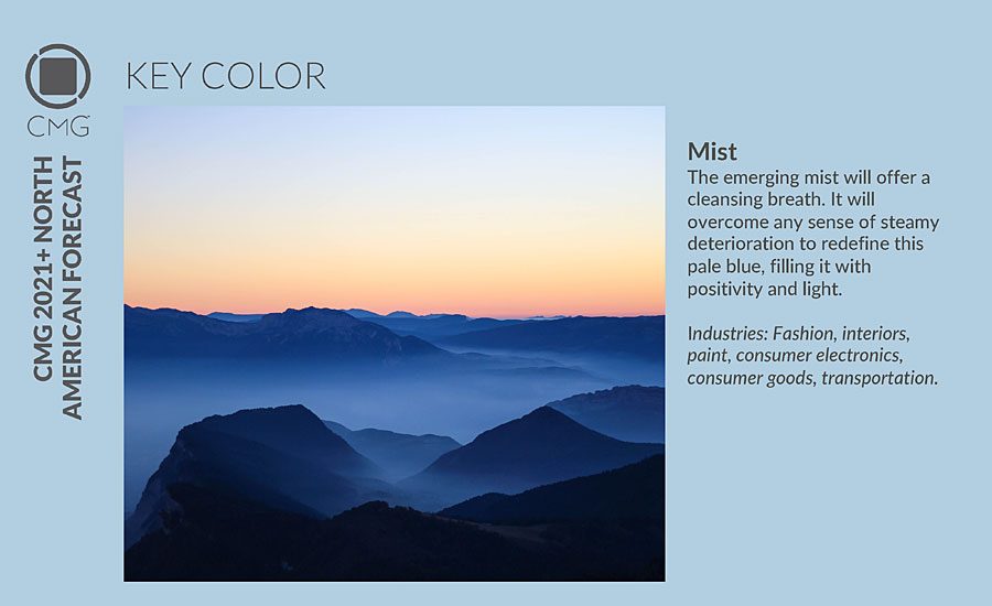
Hidefi: CMG introduced the organization’s forecasted key colors at the 2019 International Summit in Tucson, AZ, in late November 2019. The group named a key color for each of the main global regions. The 2021+ North American key color is “Mist,” a color that exudes optimistic confidence and the hopeful resolve to achieve personal and societal goals. Mist’s pale blue hue, touched with a whisper of toned grey and minimal chroma, is spirited in its lightness.
Mist will emerge determinedly into the newly established decade as it encompasses the mood, desire, and fantasy of new growth. Its lightness reflects an uninhibited look at the future and it embodies the yearning for ease and a release from discord. In addition, Mist has a sense of forward movement to seek carefree moments.
In addition to its freshness, it is also a color of contemplation, of setting the record straight, and can suggest an aura around ideas of renewal and ecology. Mere sustainability is not enough, the goal is for rethinking uses for products, their waste and byproducts. It is an encouraging moment for design and Mist is a color that suggests the transcendence in creating new products. Mist has neither gender nor age, making it ideal for fashion and consumer electronics, as well as transportation. With its ability to take on varying sheen levels and special effects with ease, Mist is a color easy to embrace.
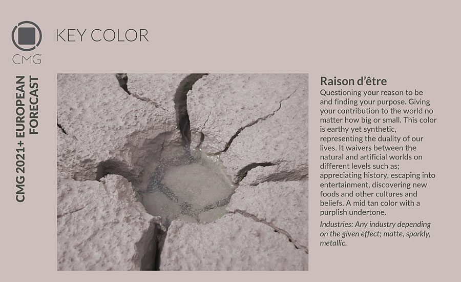
CMG’s 2021+ European key color, “Raison d’être” is a mid-range tan with a slight violet undertone that suggests both the natural and artificial worlds. Raison d’être embodies the directional thought processes, and the color trend, needed for a future of growth and innovation. It is at once earthy and slightly synthetic in appearance. Balancing the natural and synthetic are key to having a future in which all can survive. Raison d’être offers a color of balance to see lifestyles and the world on its many levels. At one moment there is a great appreciation of history, during another the driving desire to move forward. There are endless moments of discovery, looking back and forward.
Raison d’être will be found across all industries, with emphasis given to special effects, finishes and textures. The variation in effects add to the balancing nature of the color and create a “just right” application whether transportation, fashion, home décor or anything else.
The 2021+ Latin American key color is “Renacer,” a highly saturated violet that connects nature and spirituality. The red and blue core of this color represent femininity and masculinity, and its high saturation suggests the energy of forward movement.
Latin America is experiencing a rebirth that embraces multiple elements, and the complex nature of Renacer reflects the DNA of several colors in its character. Together they create a balanced hue with which to future-think. Balance is key in a fast and complex world, where there is a constant need for life transformation. Renacer is the color of that balance on the quest for balance and peace.
The transcendent nature of Renacer’s violet is also key, as the future holds new realms of personal energy and inner spirituality. With personal growth comes generosity that will extend to others, and the world, at large. A generous attitude creates a better existence for everything on the planet.
Renacer will appear in graphics, in print and digitally with its balanced, yet powerful look. Packaging and consumer goods will also embrace this hue as a color with a powerful message, but still connecting to the past, nature and humanity.
And CMG’s 2021+ Asia Pacific key color is “Uni Coral.” This strong hybrid of orange and red is a color of extreme happiness that inspires both fun and the need for action. Uni Coral exudes motivation and drive, perfect for instant attention and long-lasting energy. It is the perfect color for a “pop-up” anything, fires the energy of the moment, and thrills with the exuberance of vitality.
If artificial intelligence was to have a color, it would be Uni Coral. Warm, electric, powerful, yet familiar, it has the attributes to take on personal requests and desires. From everyday appliances to home support devices, Uni Coral adds a sense of fun to everyday products, and a touch of global awareness, as well.
The strong hue of Uni Coral expresses immediacy and exhilaration of the moment. It is a trend direction for color that is well-suited to pop-up culture from events to retail to fashion. Pop-up shops can be physical or virtual but are always energized and of the moment. The color exemplifies a moment of play that brings extreme happiness.
In fashion, celebrity bloggers will continue as important influencers and role models. They highlight being bright and fresh, with Uni Coral as a color that identifies and unites their energy and youthful vigor. The excitement carries from fashion to decorative home as “lifestyle blogging” incorporates all levels of life from wardrobe to living to cuisine.
For more information, visit www.colormarketing.org.


Report Abusive Comment